HMI Screen Design: Practical Rules That Work
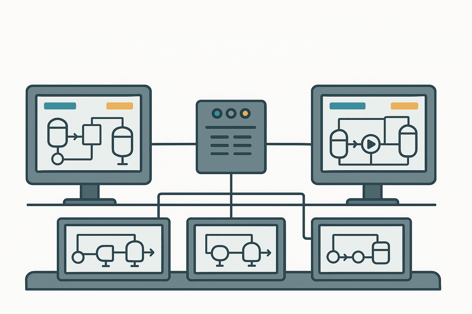
Most HMI screens are built by engineers who understand the process perfectly. That's exactly the problem. You know what every valve does, you know which pump feeds which tank, so you lay it out in a way that makes sense to you. The operator on night shift, three years after commissioning, doesn't have your mental model. They have a touchscreen, an alarm going off, and thirty seconds to make a call.
The ISA-101 standard on HMI design exists for a reason. Incidents like the 2005 Texas City refinery explosion and the Davis-Besse nuclear event both had poor operator interface design as a contributing factor. I'm not saying your conveyor line is a nuclear plant, but the principle holds: bad screen design causes bad decisions. Here's how to avoid the most common traps.
HMI Screen Design: Start With the Operator's Mental Model
Before you open your HMI software, spend an hour with the operator who will actually use the screen. Ask them: what decisions do you make most often? What information do you need to make them? What do you check first when something goes wrong? Their answers should drive your layout, not the P&ID drawing order or the PLC tag list.
A common mistake is building the screen around the physical left-to-right layout of the machine. That's fine if the operator's workflow follows the same direction, but often it doesn't. A packaging line operator might spend 80% of their attention on the discharge end, not the infeed. Put the discharge end on the primary screen.
The Hierarchy: Four Levels, One Direction
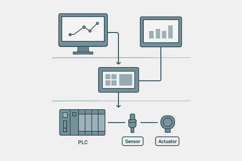
ISA-101 recommends a four-level screen hierarchy. Level 1 is the plant or area overview, showing only the most critical KPIs and alarm states. Level 2 is the unit or process section view. Level 3 is the detailed equipment view where most control happens. Level 4 is configuration, trends, historian queries, and maintenance data that operators rarely need but engineers always want front and center (don't do that).
Navigation should always go top-down. Clicking an alarm on Level 1 should jump directly to the Level 3 screen for that piece of equipment, not just Level 2. Operators under pressure don't want to click through three screens. Bread-crumb navigation at the top of every screen, showing where you are in the hierarchy, takes about 20 pixels of screen real estate and saves enormous confusion.
Color: Use It as a Signal, Not a Decoration
The single worst habit in HMI design is using color to make screens look good. Every color choice should carry a specific meaning, and that meaning must be consistent across every screen in the project. Here's the palette that ISA-101 and EEMUA 191 agree on:
| Color | Meaning | Use for |
|---|---|---|
| Grey (medium) | Normal, running, healthy | Most of the screen at most times |
| Green | Confirmed normal state or permissive met | Discrete on states, interlocks clear |
| Yellow / Amber | Abnormal, warning, operator attention needed | Pre-alarm, deviation, advisory |
| Red | Alarm, danger, process limit exceeded | Active alarms, emergency state |
| Blue | Operator information, manual mode | Manual overrides, setpoint fields |
| White | High emphasis static labels | Tag names, unit labels |
| Black | Critical alarm, highest priority | Use sparingly, reserved for safety-critical |
The background should be medium grey, not white, not black. White backgrounds cause eye strain over a 12-hour shift. Black backgrounds make it very hard to distinguish dark colors. Medium grey (around #787878 to #909090) gives you the most contrast headroom for both light and dark foreground elements.
Situational Awareness: What ISA-101 Calls 'Effective Alarming'
An alarm banner that shows 47 active alarms tells the operator nothing useful. They need to know: what is the highest-priority alarm right now, and where is it? A good alarm summary strip, pinned to the bottom of every screen, shows the top 5 active alarms sorted by priority, with a direct navigation button next to each one. That's it. Everything else goes in the full alarm list, accessible one click away.
Flashing is the strongest attention-grabber you have. Use it only for unacknowledged alarms. Once acknowledged, the alarm indicator should go steady (still colored, still visible, but not flashing). If everything flashes all the time, operators tune it out, which is exactly what happened at Three Mile Island in 1979.
Trend Windows: Put Them Where Decisions Happen
A common design puts all trends on a separate 'Trends' screen that operators have to navigate to deliberately. In practice, they never look at trends until something has already gone wrong. Embed a small inline trend window directly on the Level 3 equipment screen, showing the last 30 minutes of the most critical process variable for that piece of equipment. Keep it small, maybe 20% of screen width, but put it right next to the value display.
For a pump, that's flow rate. For a heater, that's outlet temperature. For a compressor, that's discharge pressure. The operator should be able to see at a glance whether a value is stable, drifting, or cycling, without leaving the screen they're already on.
Faceplate Consistency: One Layout, Every Device
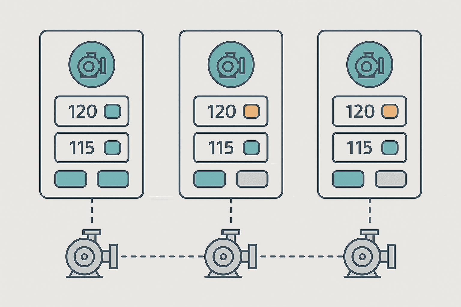
A faceplate is the pop-up that appears when an operator clicks on a pump, valve, or drive. It should show: current state, setpoint, feedback, mode (auto/manual), and control buttons. Every faceplate for the same device type should look identical. If Pump 1's faceplate has the Start button top-left and Pump 2's has it bottom-right, operators will eventually hit the wrong button under pressure.
In Weintek EasyBuilder Pro, Ignition's symbol factory, and TIA Portal's faceplate library, you can create a master template for each device type and reuse it. Do this from day one. Retrofitting faceplate consistency onto a 200-screen project is a painful week of work.
Numeric Displays: Context Beats Raw Numbers
A flow display showing '247.3' tells the operator a number. Add a thin bar gauge behind it, colored green for normal range and amber for deviation, and suddenly they can see at a glance that 247.3 is near the top of the normal band without having to remember what the normal band is. This is called a 'context bar' and it's one of the highest-value additions you can make to any analog display.
Also: match your decimal places to the sensor resolution. Displaying a thermocouple temperature as 187.4381 degrees C is meaningless noise. A type K thermocouple is accurate to about plus or minus 2 degrees C. Show one decimal place at most. Excess precision makes operators doubt whether the number is real.
Setpoint Entry: Confirm Before You Commit
A numeric entry field that takes effect the moment you type the last digit is an accident waiting to happen. Any setpoint change that affects process output should require an explicit Confirm button, and ideally should show a 'New value: 85.0, Current value: 72.0, Confirm?' dialog. Touchscreen keyboards are imprecise. Fat-finger errors on a temperature setpoint or a speed reference can cause real damage.
For critical setpoints, consider requiring the operator to enter the value twice, or requiring a supervisor PIN. Most HMI platforms support security levels natively. Ignition uses role-based security, TIA Portal WinCC uses user administration, and Weintek has a configurable password level system. Use them.
Clutter Is the Enemy: The 30% Rule
A rough but useful guideline: no more than 30% of any screen should be actively changing information at any one time during normal operation. If every element on the screen updates every scan cycle, the operator's eye has no place to rest. Static reference information (pipe routes, equipment labels, unit names) should be genuinely static in appearance, meaning it should not flash, pulse, or change color.
Remove everything from the screen that doesn't help the operator make a decision. That means no company logos on every screen, no decorative gradients on tanks, no animated rotating motor symbols (yes, people do this). Every pixel should earn its place.
A Note on Touchscreen vs. Mouse-Driven Design
Touchscreens need larger hit targets. A button that's fine with a mouse cursor is unusable with a gloved finger. The minimum comfortable touch target is about 10 mm by 10 mm on screen, which typically means at least 40 pixels square at 96 DPI. Leave at least 5 mm of spacing between adjacent touch targets. If you're designing for a Siemens TP1200 Comfort or a Weintek MT8103iE in a dusty environment, those operators will be wearing gloves. Design for it.
Documentation and Change Control: Often Skipped, Always Regretted
Every screen should have a version number and a last-modified date visible somewhere, even if it's tiny text in a corner. When a plant has three different versions of the same HMI project floating around on USB sticks, and nobody can tell which one is actually on the panel, you have a serious maintenance problem. Use your HMI software's built-in version control or at minimum keep a changelog text file alongside the project.
The ISA-101 standard also recommends a formal HMI management of change (MOC) process: any screen layout change, color convention change, or new navigation path should go through review before deployment. This sounds bureaucratic until you've had a shift supervisor call at 2 AM because an operator can't find the emergency shutdown button on a screen that was 'just tweaked' that afternoon.
Quick Reference: HMI Screen Design Checklist
- Medium grey background on all process screens
- Color used only to convey state, never for decoration
- Red-green color changes paired with a second indicator (shape or text)
- Four-level screen hierarchy with direct alarm-to-equipment navigation
- Flashing reserved for unacknowledged alarms only
- Active alarm banner pinned to every screen, max 5 items shown
- Inline 30-minute trend on every Level 3 equipment screen
- Identical faceplate layout for each device type
- Context bar behind every critical analog display
- Confirm dialog for all setpoint and output changes
- Touch targets minimum 40 px square with 5 mm spacing
- Version number and date visible on every screen
- Formal MOC process for all screen changes post-commissioning
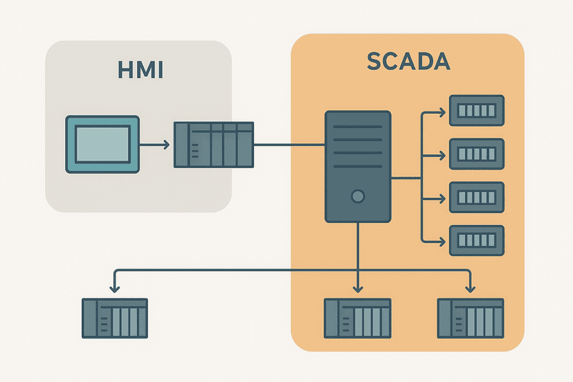
If you're building screens in TIA Portal WinCC, the HMI Programming in TIA Portal: A Practical Guide covers the mechanics of linking tags and building faceplates in that environment. And if you're still working out how the HMI fits into the broader SCADA picture, HMI and SCADA: How They Fit Together in a Real Plant is worth a read before you finalize your navigation structure.
Frequently asked questions
What is the ISA-101 standard and does it apply to small HMI projects?
What background color should I use for HMI screens?
How many screens should an HMI have?
Should I animate symbols like rotating pump impellers or flowing pipe colors?
How do I handle HMI screen changes after a project goes live?
Learn this by building it
There is a PLC in this site. It runs a real scan engine, checks your logic against the same tests a working machine would fail, and needs no download and no account.
Open the exercisesFree, no signup, runs in your browser. See all 16 exercises.
Was this helpful?